24 July 2018, by: Brenton Chelin
PREMIER LEAGUE KITS 2018/19 RANKED: FROM WORST TO BEST
The new Premier League kits for the 2018/19 season are here
The new Premier League season is nearly upon us and you know what that means… new kits!We’ve taken the liberty to list our fancies, from the worst to the best. There are some controversial calls in here, but we stand by them. Full disclosure: The writer has a mild case of colour-blindness which may have affected his judgement.
From worst to best, here’s how they rate:
20. Manchester United
There’s something to be said about the marketing machine at Old Trafford trying so desperately hard to appeal to the man on the street despite being a multi-billion dollar business. Maybe try not butchering the one thing they hold dear. A total mess and one of the ugliest kits ever to grace the Premier League.
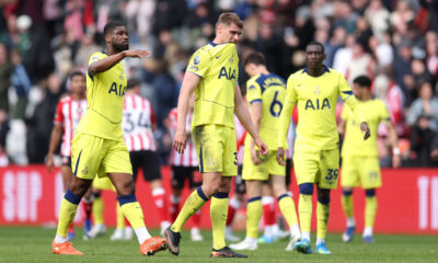
19. Tottenham
The glorious Nike Nigerian kit will be long forgotten by the time Spurs trot out in this monstrosity. Looks like it’s been designed in Microsoft Paint. An absolute horror show.
18. Southampton
The kit itself isn’t so bad, but for the fact that it is almost a carbon copy of last year’s version. Throwing on a black stroke isn’t fooling anybody.
17. Burnley
What more can you do with Claret and Blue you ask? Take a look at West Ham and Aston Villa’s latest offerings for the answer. The logo is also needlessly large.
16. Brighton Hove & Albion
It’s all just a bit dull isn’t it. Kinda like the Brighton Boardwalk on a Sunday morning after a night on the town.
15. Manchester City
For a side that played some of the most attractive football seen in Premier League history, this offering from Nike just doesn’t do them justice. Where are the stars? The gold trim? Anything to indicate just how special this team is.
14. Crystal Palace
There are mixed feelings about this one at BET Central. Some decent aspects, but the sponsor does the damage in what isn’t an all too terrible offering.
13. Newcastle
It’s rather difficult to mess up a black and white striped kit. Nowhere near the standard of the mid-90s Adidas and Newcastle Brown Ale beauties, but inoffensive enough to finish middle of the pack. Kinda like Newcastle.
12. Arsenal
It’s all change at the Emirates. New manager, new Chief Executive and new kit. Hopefully Unai Emery fares a bit better than the kit designers, though. The change in colour is a fail, as are the armbands.
11. Cardiff
In a word: Neat. The two-tone blue stripes, the traditional Adidas sleeves, the V-neck collar. Throw in the Bluebird badge and you’ve got a solid effort for their return to the Premier League.
10. Watford
The most Marmite kit of the bunch and somehow we’ve slapped it in the middle of the pack. Reminiscent of the best Dortmund kits of the 90s. Some nice negative space work with the badge and the stripes gets it into the Top 10.
9. Liverpool
New Balance have failed to reach the heights of last season’s showstopper with their latest. Kept the beautiful darker shade of red and added a button-up collar, but the white trim doesn’t do it any favours. Victims of their own success.
8. West Ham
Umbro have quietly turned out a number of solid efforts, starting with this understated beauty for The Hammers. The horizontal maroon stripes are a nice touch.
7. Leicester
Adidas have gone back to basics with their first effort since ousting Puma as the Foxes kit suppliers. The button collar is replaced by a v-neck, with the gold trim adding a little summin’ summin’ to the mix.
6. Chelsea
It’s rare to find Chelsea this high up the list, but credit where it’s due. Nike have managed to produce a kit that harks back to the 80s but still maintains a modern feel. Well played.
5. Huddersfield
Huddersfield took the lessons learned from Leeds’ badge debacle and produced something truly stunning. The Terrier is back after 50 years in what is probably the best badge in the league. The understated design helps to make it the star of the show.
4. Fulham
Good lord, this is a looker. Adidas have produced a distinctly German effort, but in the best way possible. The sponsor has played ball by allowing a colour change which all adds up to the thing of beauty.
3. Bournemouth
There’s something to say about a sponsor that works perfectly with the colours of team. The red, black and gold flow seamlessly from the Umbro diamond logo on the sleeves to the gold trim on the collar.
2. Everton
After last season’s ‘Sweaty pits’ effort, Umbro have pulled something miraculous out the bag. The melange design with a two-button collar adds a real touch of class. Would be top were it not for the unsightly Angry Birds logo on the sleeve.
1. Wolves
Welcome back to the Premier League. Adidas have produced a real ripper here. The slight departure from the deeper orangey-type shirts of recent years in favour of a brighter and more traditional amber is a masterstroke. The badge is a winner and the sponsor works perfectly to produce something truly memorable.


FIFA World Cup 2026
World Cup Preview: Brazil vs Morocco Predictions and Score

FIFA World Cup 2026
Co-hosts Mexico win the 2026 World Cup opening match


FIFA World Cup 2026
Mexico Legends Beat Bafana Bafana Legends in World Cup Rematch


F1 News & Updates
Belgian Grand Prix Review

F1 News & Updates
F1: Hungarian Grand Prix Preview And Predictions


F1 News & Updates
Austrian Grand Prix Review – Verstappen and Perez Shine in Spielberg

International And Local Golf News And Tournaments
Podcast: US Open Golf Betting Preview